


With today’s templates and content management systems (CMS), creating a responsive website is pretty much a given. Most website builder tools can automatically optimize a site’s layout to look good no matter which device it’s viewed on, whether a mobile phone, tablet, laptop or desktop computer.
But is there still a place for adaptive design vs. responsive design? While not as popular (or easy), there may still be a place for taking an adaptive design approach.
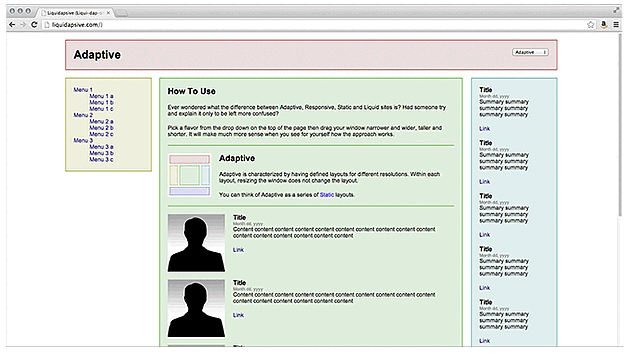
First, let’s make sure we understand the difference between responsive and adaptive design.

As you can see in the example above, the content on a responsive site “responds” to a user’s varying screen size. When viewed on a smaller screen, such as a mobile device or tablet, images and text adjust accordingly, creating a more streamlined, appealing look.
The benefit of responsive layouts for web developers is that they only have to create a single version of a web page rather than reformat it for every possible screen size that users may have. This is accomplished by using special coding with CSS3 media queries.
Similar to responsive design, adaptive websites also feature the ability to have your web content adjust accordingly to the viewer’s screen size. However, instead of having your content repositioned on every screen size, designers use a series of static templates based on different breakpoints in a page’s pixel width on a given device. Whenever a screen reaches a certain pixel width, it automatically adjusts to the next, smaller template until the device width reaches the next breakpoint, and so on.
For most scenarios, a responsive design is the standard for web developers who want to be taken seriously, and it’s an automated feature for most Content Management Systems. Just because it’s a given, however, doesn’t mean there aren’t occasional glitches. For example, some web pages contain tables or graphics that may not be as responsive as you’d like.
Looking at the two styles side-by-side, it seems pretty clear that responsive design allows for more flexibility within a webpage. Whereas an adaptive site might only offer a few different layouts, a responsive design adjusts the content to nearly every change in screen size for an optimized layout. With all the different device sizes for mobile, tablets and desktop these days, it’s easy to see why it’s a better choice overall. Your content not only looks better, but is also easier to take in and understand.
Plus, with website platforms like HubSpot’s Content Management System, responsive design is easy to implement, giving every business the capability to create highly-optimized, attractive websites.
When it comes to choosing responsive vs. adaptive web design, it’s game over. Responsive is the clear winner and obvious choice. However...
Despite all the benefits of responsive design, there are rare occasions when you may want to use an adaptive design.
One such scenario is if you have a highly targeted audience that uses a specific device. Take, for example, a large service company’s team of field technicians who are all issued the same model smartphone or mobile tablet. They use that device to receive dispatch instructions, access product manuals, order parts, or fill out online service forms and reports within a company’s secure portal.
A web designer may want to design and develop adaptive web pages specifically tailored to the resolution and screen size of all those uniform target devices to override the responsive settings. In this instance, there’s a place for adaptive design to ensure that forms, tables and other content always display consistently.
Why is responsive design important? Google’s search engine rewards websites that focus heavily on a mobile-first design approach (aka “responsive”). Mobile-first indexing for all new websites began July 1, 2019. That means that Google’s algorithms prefer websites that are optimized for mobile and will rank them higher in searches.
Instead of crawling the desktop version of a web page, Google looks at the mobile version. And, if you don’t have a mobile version, Google might just pass you by.
Related: 6 Tips for Creating a Seamless Mobile-First Website Experience
For now, Google says it’s monitoring and evaluating older or existing pages based on their list of best practices. However, it’s likely just a matter of time before all websites will need to conform. If you haven’t taken steps to implement a mobile-first website yet, the time is now. That is, unless you prefer to fall behind your competitors who are already leveraging the SEO benefits of responsive web design.
Shifting to a responsive, mobile-first web design is just the beginning — a foundation, really. To discover all the building blocks for creating a killer website for your B2B company, access our Inbound Websites for Manufacturers Planning and User Experience Guide below. Even if you’re not a manufacturer, you’ll get lots of practical information to guide your web strategy.
And if you’re considering implementing an inbound marketing program, we’ve got expert web designers and inbound strategists who are eager to help. Contact us to learn more.

Topics: Website Design
