


Web design is an evolving art.
When the web was first built, websites were little more than text and links, mostly used by academic institutions. For a quick look back, take a look at the original Space Jam site, archived on Warner Brothers' website.
Today, the web is host to just about any kind of multimedia experience you could desire.
With the endless possibilities that are available, it's important for your website to have designed elements that communicate your business' value to visitors. These design elements will ensure that people can find what they are looking for, and come back as you continue to build and develop your website and content offerings.
People are impatient. They want to find the answers to their questions without a lot of work. A good way of doing that is by presenting them with a simple menu with clear and obvious navigation.
People like to read left to right, so put your most important items in the farthest left menu item. People are also used to standard menu conventions, such as having a link to your contact information at the far right.
It follows that the most important elements of your menu are those at either end. Make sure they contain the most relevant information for a website visitor.
Take a look at Weidert Group's menu. We are an inbound marketing agency. Our first menu item is Inbound Marketing, which is a link explaining the principles of inbound marketing. Obvious, right?

The main purpose of our website, from our perspective, is to get you to request a consultation. That's why we put a “request free consultation” button in the header on the right side, maximizing its visibility.
A visitor should be able to look at your website for two seconds and know immediately what you do. A clear statement in the above-the-fold area is an ideal solution.
Modern websites usually do this with a simple statement over a hero image, followed by a call-to-action to learn more.
 Take Stripe, for instance. One look at their hero image and you know what they do. “Web and mobile payments, built for developers." They follow this with CTAs to learn more or sign up.
Quick.
Clear.
Effective.
It used to be considered standard to try to put all your content above the fold, or the area of the webpage visible before someone needed to scroll. This led to websites with everything shoved together into a jumbled mess of text, links, images, and buttons.
Thankfully, modern web design has moved on. Users are more used to scrolling through long pages that give content room to breath.
Make sure your website gives your content plenty of space between elements. This lets each element stand out and communicate clearly instead of getting lost.
I’ve looked at your menu and read your value statement. Now what?
Calls-to-Action are one of the best ways to guide your visitors through your website.
A call to action is usually a simple button with a clear statement of what that button will do.
Firefox has a great CTA directly below their value statement. The bright color makes the button stand out on the neutral background. “Free Download” tells me what clicking this button will do.

Beyond the homepage, you should be using CTAs to guide your visitors to content and other offers. We recommend at least one CTA in every blog post you write, linking to your landing pages.
You can also use CTAs to guide individuals to your contact page if they aren't finding what they're looking for.
Your website needs to have good written content for your visitors. What it does not need are large paragraphs and pages of nothing but text.
People don’t read websites like they do a novel.
People skim.
Help them find the content they are looking for by highlighting important text. Headlines draw users' attention, along with bolded text.
Breaking up content also helps.
Make your paragraphs short, and add spacing between them.
These elements will help your visitors digest the content and better understand your offerings.
The best kind of visitor is someone who already knows who you are, what you do, and wants to talk to you. Make their task easy by making your contact information obvious.
People have become familiar with the standard location of contact information in the top right area of a website's menu. That's a great place to put your phone number or a link to your contact page.
On your contact page itself, make sure to include a form that is easy to fill out. Also, include email addresses and phone information for individuals that prefer those methods of communication.
If someone is viewing your website on a smart phone, chances are they're visiting your site to find your phone number or physical address. If you have a responsive site, and you should, make sure that someone visiting from a smart phone can easily find your contact information.
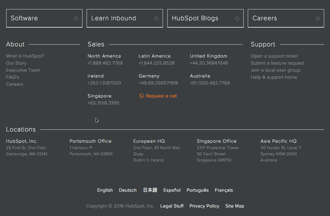
When a visitor gets to the bottom of a webpage there is still an opportunity to help them find the information they need. A well-designed footer should act as a high-level site map with links to all the major parts of your website. It should also have contact information.
Take a look at HubSpot’s footer. Not only do they have contact information for all their offices, they also have links to their About information, Support tickets, and menu drop downs for all the major sections of their site.
The days of clip art and low resolution images are over. Modern broadband connections allow for high-quality images to support your other website content.
Creating great images is also easier than ever. Even smart phones can create stunning images if you know how to use them to their advantages.
Having said that, you can’t just upload a multi-megabyte high-resolution image and call it a day. Make sure your images are optimized for web viewing by using compression techniques and appropriate image sizes. No one is going to view your site if it takes forever to load.
One thing you should never show a visitor is a dead end.
A dead end is a page that leaves your users hanging when they reach the bottom of it. You should always have another CTA to guide them, link to follow, or resource to download.
Speaking of things to download...
Topics: Website Design