


As users of search, we continue to get smarter about finding the answers to our questions and solutions to our problems. Google continues to get smarter, too, as they create the best search experience on the Web, with continued advancements that get us the search results we expect with far less effort than ever before.
Another advancement in creating this experience is the introduction of Google's new "mobile-friendly" label.
 Introduced in November, and rolling out globally before the end of 2014, the new "mobile-friendly" label favors websites that offer the desired experience for users on a mobile device. This means that the user can easily view the website's content without needing to zoom in on the page or scroll horizontally to read the page content. You may have started seeing this label yourself when doing a Google search on your mobile device.
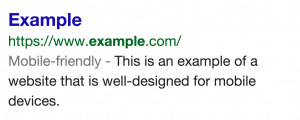
This is Google's attempt at telling mobile search users, "Hey, click on this listing. It will look and work great on your mobile device." As you can see from the example here, the label is understated but gets the point across.
Up until this point, unless the website had a truly mobile website URL (m.example.com), which is now unnecesarry with the adoption of responsive website design, it wasn't clear which search results were mobile-friendly until you clicked through on them. We all know how frustrating that is.
So what is the SEO impact of this new feature? And is this Google's next attempt at giving companies another nudge to get serious about mobile, if they haven't already?
It's pretty obvious that websites that appear in mobile search results with this label, versus those that don't, will receive more click-through traffic - especially in situations where only the website on the first page of results, even if it's not the first result, appears with this label. Think how powerful this could be for a company in a niche B2B industry, where their competitors have all fallen behind on keeping their website updated and mobile accessible. By being the only website focused on mobile users, and providing better content aimed at helping the user, they could have their way with getting more traffic and ultimately more leads and sales.
Unsure whether your website or a competitors is seen as "mobile-friendly" in Google's eyes? You can test it here.
You've likely heard some buzz by now on the advantages of a responsive website. The truth is, even though responsive web design has been around since 2010, millions of companies still haven't taken advantage of the many benefits it has to offer.
As I noted earlier in this article, the introduction and evolution of responsive web design has eliminated the need for having a separate mobile website. This is crucial for companies who are adding and updating content on their site on a weekly basis, who would then be forced to update that content in two different places. With a responsive website, you have one central website that is updated in one place and works beautifully on any screen size/device.
In Google's eyes, this type of website is preferred. They can find all of your content in one place under one domain (benefiting your SEO), and they know the content and user experience will adapt based on the user's device. So, they'll gladly label this type of site with their new "mobile-friendly" label.
If you still haven't adopted a responsive website design you'll be happy to know it doesn't have to be a budget breaker to obtain. With certain website platforms like HubSpot's Content Optimization System (COS) being responsive out of the box, or one of the many themes in the WordPress marketplace being built to be responsive from the start, a responsive website can be obtained easier than ever before.
For additional reading on creating an optimal website, check out our recent blog articles "Websites Today: More Leads Means Being More Helpful [Video]" and "Why Every B2B Company Needs an Up-to-Date Website in 2015."

Topics: Search Engine Optimization, Website Design
