We’re closing out our three-part series on conversion rate optimization (CRO) basics with perhaps the most effective tool for improving your inbound program: landing pages. After all, persuading visitors to exchange their contact information for your content offers is at the heart of generating leads from new and existing traffic.
If you missed parts 1 and 2, you can find them here:
But, landing pages aren’t magic. You need to carefully construct and leverage them to achieve the desired results. Applying these 10 landing page guidelines is key:
1. Keep it Simple
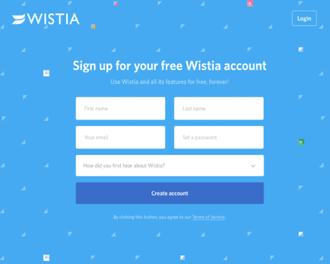
Your landing page’s design should be simple and clear to prevent visitor confusion and distraction. Don’t overstuff it with copy; just provide enough details so visitors know what they’re getting. The same holds true for forms: Don’t go overboard and ask for too many personal details. Start out by sticking to the basics — name, email, industry, and company — and be sure to use smart forms so you’re not asking for info you already have (see number 9, below).
2. Write Consumable Copy
Part of keeping it simple means speaking the language of your target audience. Landing pages stocked with jargon, buzzwords, or complex language confuse visitors. Stilted language can also make visitors suspicious of a hard sell, which could mean they don’t convert.
Start with an attention-grabbing headline that compels visitors to stop and consider your offer. Once you have their eyes on your landing page provide clear, concise messaging, especially if the content offer doesn’t need much explaining (e.g., price quote, free sign-up, etc.). For advanced content, don’t be afraid to remind visitors of what’s in it for them — a glimpse of what’s inside that guide or the value-add of an infographic can go a long way in enticing a conversion.
A quick reminder about content: Take the time to optimize headers and actionable copy on your landing page. Also include several ways (buttons, anchors, CTAs, pop-ups or chatbots are all possibilities) for visitors to access the conversion form regardless of where they are on the landing page. The easier the information submission, the easier the conversion!
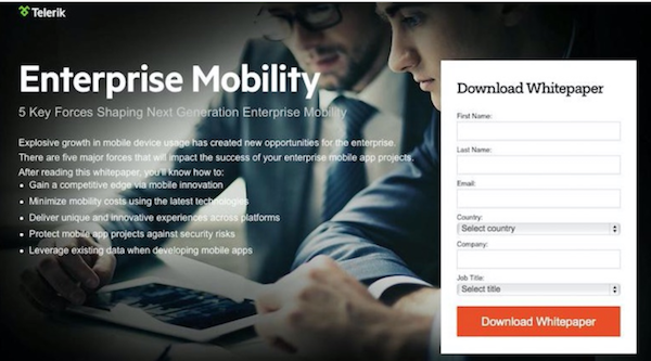
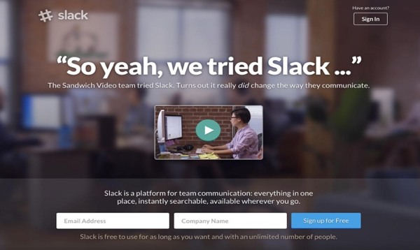
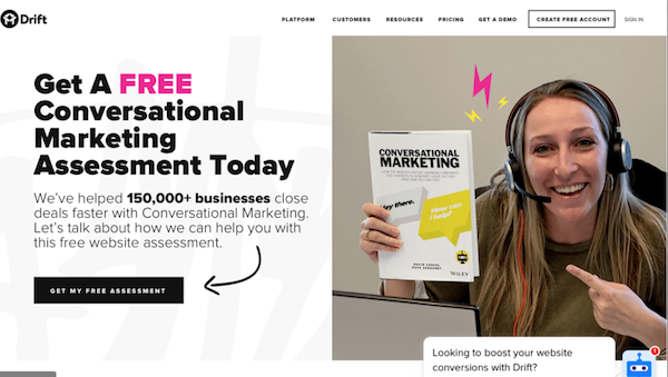
3. Include Images and Videos
While catchy headlines and relatable copy attract visitors, they may not be enough to maintain interest. In order to keep visitors engaged and enhance their experience, include a video, an image, or both. In fact, using videos on landing pages can increase conversions by 80%!
Here’s a great example of how business communication giant Slack leveraged video to make their landing page informative and interesting:
4. Remove All Navigation
Your landing page has two jobs: pitch the offer and land the lead. With that in mind, it’s crucial that you eliminate any distractions that might cause visitors to stray – including your site’s navigation bar and other hyperlinks. With nowhere else to go, visitors can focus on and respond to the offer at hand.
5. Optimize for Mobile
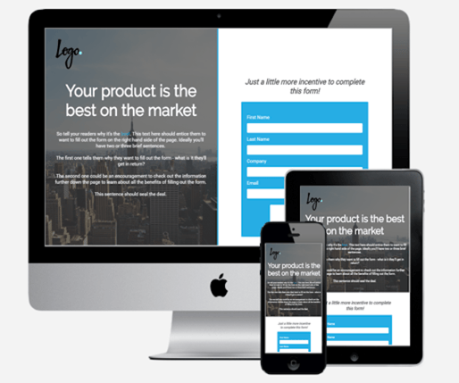 The majority of people use their smartphones and other mobile devices to access the Web versus their computers, making landing pages optimized for mobile crucial for winning conversions. The jumbled mess of forms, videos, and other visuals that can result from a non-optimized mobile experience could well be enough to take a visitor from interested to frustrated to gone.
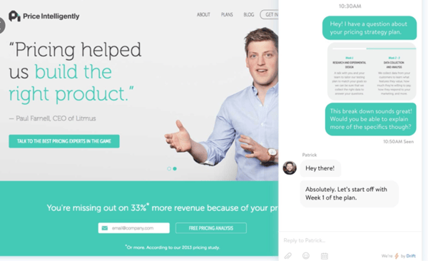
6. Be Aware of Form Placement
Visitors can form an opinion about your landing page in as little as 50 milliseconds — less than a blink of an eye!1 It’s important, then, to keep everything you want visitors to see “above the fold.” Your headline, unique selling proposition (USP), and call to action (CTA) should be loud and proud. It can be a fine line between just right and too much — remember you don’t want to crowd out your CTA — but leveraging the value of the above-the-fold real estate means accommodating your visitors. Make it as easy as possible for them to make a decision.
But now you’re thinking that landing pages are rarely so short that everything can be above the fold; true in most cases. Using visual cues — even as something as literal as an arrow — helps move the eye and the scroll bar while directing focus to the form and the goal: conversion.
ALSO READ: 5 Ways to Prevent Spam Submissions Using HubSpot Forms
7. Consider Chatbots
Conversational landing pages with chatbot engagement are becoming increasingly popular as an alternative to form-driven pages. For visitors, chatbots ramp up how they participate in the buyer’s journey. For companies, chatbots are a fairly unobtrusive way to gather lead-qualifying information and boost conversion rates. A quick back-and-forth with a bot can be far less intimidating than a multi-question form.
8. Ask the Right Questions
The questions asked on your form will largely determine if visitors will actually complete it. Use these guidelines to shape your approach:
- Limit the overall number of questions to somewhere between 3 to 10. Any fewer and the form will provide no value to you; any more, you start scaring visitors away
- Before you ask any detailed questions, make sure you get their basic contact information: first and last name, email, and company
- Talk with your sales team to determine which questions will garner helpful responses and ultimately improve lead quality
9. Use Smart Forms for Returning Visitors
Though it’s certainly great when a new visitor downloads your content, it’s even better when they come back for more. Why? It confirms that they view you as a trustworthy authority. Repeat visitors are also indicators that your nurturing efforts are resonating!
Increase the chances of a lead reconverting on a second offer by using progressive profiling to eliminate form questions they’ve already answered. This simple act has a dual benefit: it makes the experience easy instead of annoying for repeat visitors, and you can ask new, more detailed questions about their needs.
RELATED: The Latest Conversion Form Best Practices for B2B Lead Generation
10. A/B Testing
Using landing pages without testing them is a risky proposition. You could be missing out on lead conversions and not even know it. A/B testing is a simple way to improve landing page performance because it allows you to control what elements you test, when they’re tested, and comparative results. Simply stated, A/B testing gives you quantifiable fixes when something is awry with your landing page.
RELATED: Tips for Conducting an Effective A/B Test
Landing pages are key to lead generation and inbound marketing results. When paired with the versatility of the Growth-Driven Design Methodology, you can harness the power of your website to continuously improve the user experience and effectively grow your business.
SOURCE
1Instapage, Web Forms: What's the Ideal Placement on Your Landing Pages?, February 11, 2020

You May Also Like...
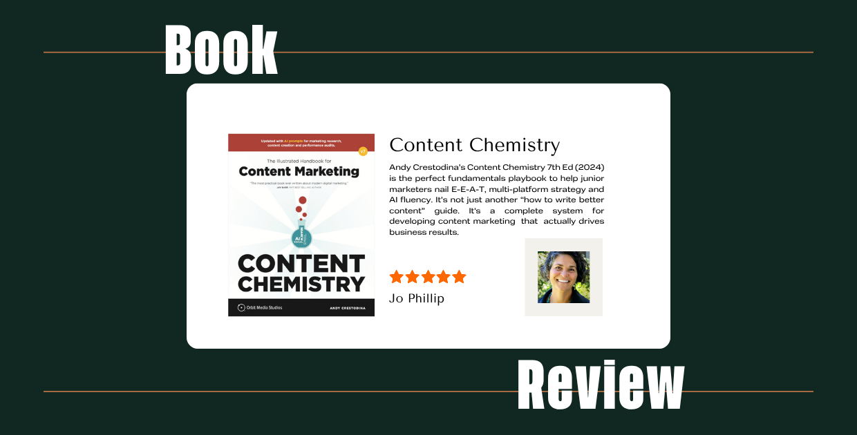
Content Marketing
AI-Era Marketing Simplified: Content Chemistry, 7th Edition

Marketing Case Studies
How ESOP Partners' Website Strategy Boosted SQLs by 900%

Marketing Technology
What is an AI Agent? Ready or Not, They're Reshaping How Industrials Market & Sell
