Don’t let the simplicity of the humble website call-to-action (CTA) button fool you. It has great power. A properly designed CTA can initiate, strengthen, and foster customer relationships — and, really, isn’t that the point of marketing?
What makes a CTA effective? If you search online, you'll find lots of call-to-action examples that you can't help but click. Sure, they look great, but what makes them work?
By transparently describing what the user can expect when they click, optimizing CTAs for responsive design, and placing them where it makes sense to the user, you can improve conversion rates. Let's take a look at some CTA examples and images that can help you get started.
Effective Call-to-Action Examples
Marketers have a real opportunity to orchestrate relationship-building conversion strategies, and call-to-action buttons are a great tool for guiding visitors along that path.
Effective CTA examples that are optimized to improve performance include:
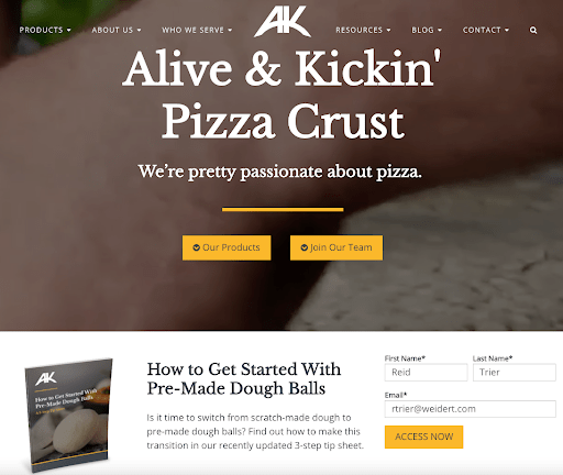
1. Above-the-fold CTA Example
One of the easiest ways to optimize a CTA is to simply move it from the bottom of the page to near the top. Making a CTA one of the first things a website visitor sees helps remind them of your most valuable content. Place your best performing offer above the fold and only ask for minimal information — just their email address and maybe a name, no more.
RELATED: 10 Must-Have Conversion Optimization Tools to Capture More Leads
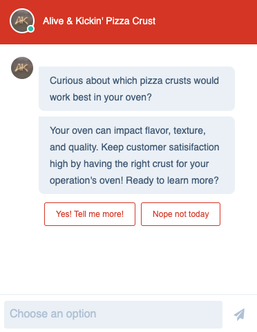
2. Chatbot CTA Example
Chatbots are known for their ability to simulate conversations and answer customer service inquiries. But don’t minimize their ability to engage potential customers. A CTA in the form of a chatbot can feel less intrusive than some other types of CTAs.
Online users are becoming more accustomed to engaging with chatbots, and using AI they are able to be “smart” — recommending customized offers based on a user’s past engagement, helping to ensure that they truly provide value. Remember to keep these types of CTA chatbots simple to increase the likelihood of conversions.
3. Pop-up CTA Example
Some pop-up CTAs have gotten a bad rap for how they sometimes annoyingly interrupt a user’s experience. But when designed and placed properly, they can be a conversion machine. With the help of HubSpot’s pop-up form building tools, these CTAs can be designed to appear strategically and in various locations on a website. These forms might include a drop-down banner, a slide-in box from the left or right, or a true pop-up.
For example, if someone is spending a fair amount of time reading a blog, a pop-up can appear to the side encouraging them to download a related content piece or be encouraged to “take this blog with you” in the form of a PDF.

4. Video CTA Example
Landing pages that feature video have a 41% higher click-through rate than plain text, and can increase conversion rates by more than 80%! Video statistics like these are compelling, but are you using those videos to their fullest potential? Including clickable CTAs within your video content allows someone to go beyond just viewing the content to actually engaging with it.
Prompt viewers with CTAs that direct them to another video or content offer, ask them to subscribe, or contact your sales team. Leverage the power of video with actionable steps that bring results.

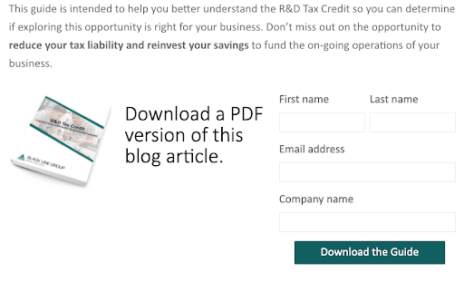
5. Inline Blog CTA Example
There are times when a particular blog performs exceptionally well and far beyond what you could have ever anticipated. One way to maximize its performance even further is to recreate it as a downloadable content piece with enhanced graphics. It can become a great takeaway that your target audience can share with colleagues. Then, offer the expanded version as an inline CTA early on in the original blog post, such as right after the introduction or first main point.
This CTA could be a simple link to a landing page, but even better is to embed a CTA graphic with a short inline form so the reader doesn’t need to leave the page, as with the example below.
6. Sidebar CTA Example
It’s important to maximize all the real estate on your website, and a sidebar CTA can do just that. Sidebar CTAs are more subtle and non-threatening than most other CTAs as they don’t interrupt your prospect’s user experience. Because of that, there’s a chance they might not get noticed, so be sure to use attention-grabbing headlines and graphics to help it stand out.
Sidebar CTAs don’t always need to tie into other content on the page. Rather, they might promote an upcoming webinar, a free consultation, or a blog subscription. It’s important to note that sidebar graphics are generally reserved for desktop viewing.

7. Blog Footer CTA Example
Our last example is probably the one you think of first! CTAs are often placed at the end of a blog post for good reason. If someone reads a blog all the way to the end, chances are they’re engaged and want to keep learning. A relevant CTA — along with a written invitation in the closing paragraph for the reader to “check it out below”—will generally receive more qualified conversions.
This is where looking at the quality of leads generated from CTAs is important. A blog footer CTA might not get as many leads as other forms, but quality trumps quantity every time.
CTAs are a small but highly impactful tool in optimizing inbound marketing search and conversion rates. Speaking of blog footer CTAs, check out this one containing even more ideas for improving your inbound marketing efforts. You know what to do. (Click the button. That's what you do.)


You May Also Like...

Video
How to Execute a B2B YouTube Strategy That Compounds

Lead Generation
Loop Marketing Express Stage: Build an AI-Ready Marketing Foundation