
You want buyers to be wowed by your company’s website — that is, if they can actually find your website.
It’s one thing to have a stunning online presence, but that doesn’t mean your site will convert or function the way you want it to. Likewise, you can have a website that technically functions properly with all the right features and killer content, but if its design or user experience (UX) is off-putting (or, worse, downright ugly), it can tarnish your brand and will ultimately result in less traffic and conversions.
Ideally, you’ll achieve just the right combination of form and function. We interviewed three of our web developers to get their perspectives on website design trends for 2020: Justin Harrison, our creative web design wizard, tackles the newest visual design trends while Jon Stanis and Bryan Schneidewind, our self-proclaimed UX snobs, dig into the latest conversion strategies for 2020.
Visual Web Design Trends:
- Mobile-first design
- Natural Organic Shapes and Minimal designs
- Isometric Design
- GIFs and Subtle Animations
- Video
UX Web Design Trends:
- Accessibility
- Conversion Rate Optimization and GDD
- Multi-page Forms
- Bots and Pop-up Forms as Conversion Methods
- Voice Interactions
Justin’s List of 2020 Web Design Trends
1. Mobile-First Design
There’s definitely a shift in how we approach web design as about half of all web traffic worldwide now comes from mobile devices. It’s not a stretch to think that it will soon be the primary method for people’s online activities. Instead of starting out with a desktop version with a responsive design that adjusts to make sure it works on mobile, many are taking the reverse approach.
Industries that see heavy traffic on mobile, such as banking, insurance and technology solutions, should really consider moving in this direction. Websites with a mobile-first approach load faster to make for a better user experience. And Google looks at performance from a mobile standpoint not desktop, so a terrible mobile experience will negatively affect a website’s ranking. I see increasing adoption of mobile-first design in the next few years as more people rely on their handheld devices to connect online.


2. Natural Organic Shapes and Minimal designs
In many ways, these design elements are separate, but they work together in terms of overall direction for your web design. More abstract, asymmetrical images that mimic natural curves and fluid organic shapes are dominating trends right now. Those who prefer to stick with more linear features are violating traditional symmetric grids.
Widely accepted design “rules” such as using odd numbers or staying within boundaries are being shaken up. There’s a lot of white space that’s off balance, copy that expands beyond the text box or doesn’t have a box at all, and overlapping images. These fluid and overlapping shapes help break up rigid structure and offer a level of free-form depth that feels inviting to visitors. Want to make your design stand out even more? Many designers are creating tailored custom illustrations to feature truly one-of-a-kind designs.
3. Isometric Design
For quite some time, graphics, icons and call-to-action (CTA) buttons have been pretty straight forward: a flat image on the screen. Product designers, film makers and printers are exploring how to make their creations in 3D, and web designers are also finding ways to add dimension to their sites.
Incorporating an isometric web design may be as simple as adding a shadow to an illustration or making a navigation bar button appear raised. Using graphics that are angled to show shadows and highlights helps them appear to jump off the page and stand out. This is especially important for CTAs to help site visitors know where to click. Once you start working with isometric design, it’s tempting to go overboard, kind of like when you first discovered vintage fonts. Remember when everyone on the planet was going retro? I knew it went too far when Kmart started using it. Keep it simple and resist the temptation to add unnecessary clutter.
4. GIFs and Subtle Animations
When it comes to web design trends, 2020 is proving that what’s old is new again. GIFs were big in the late 90s and early 2000s, but they’ve definitely had an upgrade since then. GIFs being used today aren’t necessarily funny; rather, they’re using subtle animations and showcasing images and content that naturally fade in and out or move across the screen.
I think this is a trend that has some staying power as marketers look for yet another way to capture our attention. SImilarly to isometric design, you don’t want to overdo it, though. Remember when you discovered all the features available on PowerPoint and included crazy animation on every slide? Yeah, don’t be that guy. Be subtle.
5. Video
Video backgrounds on websites are going to stick around because they can instantly communicate what your company is about. It’s popular now to feature “B-roll” footage on the home page and then have a button to play the full corporate video in a pop-over lightbox. We’re finding this approach is being well received when the featured footage is done well and is intriguing, enticing users to click and watch the full video.
Of course, there are plenty of other ways to feature video, so be strategic about placement and get creative. People love video, and Google is putting more emphasis on mixed search page results, meaning a web page with video is more likely to rank higher than standard text.
Jon’s and Bryan’s List of 2020 Web Design and User Experience (UX) Trends
1. Accessibility
Creating a great online user experience for those with visual impairments isn’t always on a designer’s radar, but there’s a growing need for accessibility. Having alt text for images is a start, but beyond that, we need to make sure that content is structured so those with screen readers can easily decipher the information. For some, it’s not a nice-to-have but a must-have, at least as far as the courts are concerned. Consider the recent case that went before the Supreme Court which upheld a lower court’s decision to require that pizza giant, Dominos, make its website accessible to the disabled. This was after a blind man was unable to order food on the company’s website or mobile app despite using screen-reading software.
Other considerations are contrast ratios. While a light grey background with slightly darker text might be the look you’re going for, there are those who won’t be able to read it very well. Check out the guidelines provided by W3C, a web accessibility initiative.Accessibility considerations aren’t just for those with physical impairments. We also need to consider accessibility for those without high-speed internet or those using mobile devices with poor cell reception. Stuffing websites with excess script, large images or code running in the background can take forever to load. Structure your site for “lazy loading,” which only loads the necessary text first or doesn’t load images until you scroll down to where they are. This does increase page speed, but can also cause issues with web content shifting around after a visitor is already reading it.
2. Conversion Rate Optimization and GDD
No longer can you redesign or overhaul a website every two to three years and expect it to perform well. Every website needs to be constantly updated or it will quickly become outdated. This Growth-Driven Design approach uses continuous improvement cycles driven by analytics to determine what needs updating. A continuing trend in website architecture and SEO is content pillars. We see a lot of success with pillars and other sites, encouraged by HubSpot, are catching on.
RELATED: 10 Must-Have Conversion Optimization Tools to Capture More Leads
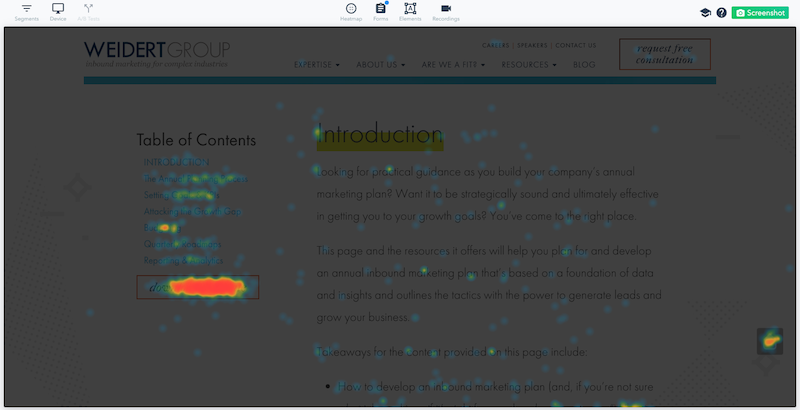
It’s good to have an opinion about what might look good, but the best way to improve a site’s functionality and engagement is to look at data to see how people are actually interacting with your website. Tools like heat maps can show where people are disengaging or exiting pages and indicate where you might need to rearrange content or insert something enticing to keep them on the page. The set-it-and-forget-it website is a thing of the past.
3. Multi-page Forms
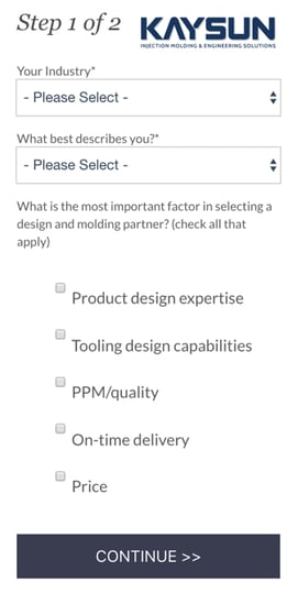
Multi-page (or multi-step) forms take a longer form on a landing page and split it up so that you submit a bit of information on each page. It makes a form seem less intimidating, and once someone has started filling out the form they are more likely to complete the process. Humans naturally want to finish what they have started.
For example, say you have a form with eight fields of information that you’ve determined you need in order to qualify a lead. That length may drive some users away. Instead, you could split that form up into two four-field forms across two pages. When the first form is filled out, the user is presented with the second half to complete. You certainly don’t want to trick the user, however. Add wording to the form indicating that there’s more to come so users understand that it’s a multi-step process.
4. Bots and Pop-up Forms as Conversion Methods
While gated content and contact forms definitely still have their place in inbound marketing web design, the adoption of pop-up forms and chatbots using artificial intelligence can be seen almost everywhere and on every page. To me, it’s almost a negative trend and one where web designers should tread lightly. Why?
When a website constantly asks you to convert — sometimes before you even have a chance to know what it’s about — it can get annoying. Really annoying. Not only that, if your bot or short form only asks a single question, there’s little way to filter the quality of those leads.
Bots and pop-up forms can be great tools when used strategically, but, once again, analytics will tell the story best. Each web developer will need to determine just how well or how poorly these various methods work for converting good quality MQLs and SQLs.
5. Voice Interactions
It’s just a matter of time before voice technology and website design cross paths. In some cases, it’s already happened. Take, for example, Google search via voice. For now, it’s a niche feature that only gets used on a limited basis on business web pages. Generally speaking, voice command technology simplifies things in our life, but will it also impact how we interact with B2B websites? Only time will tell.
There you have it! You can probably tell that having Justin, Jon and Bryan on our team creates a force to be reckoned with! Take their advice when approaching web design by balancing form and function. Better yet, take the next step and have them help you optimize your website to make it the best it can be, both visually and functionally.
Reach out to us today to discuss your website needs. Plus, download our Growth-Driven Design Checklist for tips on how to take a data-driven continuous improvement approach to web design.

You May Also Like...
Video
How to Execute a B2B YouTube Strategy That Compounds

Lead Generation
Loop Marketing Express Stage: Build an AI-Ready Marketing Foundation