 You can’t improve what you don’t measure. If I didn’t know better, that quote might have been written as part of an inbound marketing strategy. Your digital marketing metrics are the key to assessing and improving your efforts.
But there’s a problem that comes with most reporting...it can take forever! B2B marketing managers often need to gather metrics that are pulled from a variety of sources. Then they need to analyze the data, provide written analysis on trends, and ultimately build a report that looks visually appealing! That’s a ton of time that marketing managers simply don’t have.
Thankfully, tools have been developed to help glean all that data in a fraction of the time it would have taken to do it manually. Today, I’ll focus on Databox’s solution to help you overcome these major pain points.
What is Databox?
In short, Databox is a business analytics platform built to help you understand what's going on with your business. It’s been ranked as the #1 most usable data visualization tool by G2 Crowd.
The tool allows you to collect data from more than 70 platforms. The great part is you don’t have to log into each of those accounts separately. With Databox, you can view everything in one place, mix and match the metrics you want to see, and even customize how you want to display your results.
Benefits of Databox Marketing Metrics
Not only does Databox streamline the entire reporting process because of the way it integrates with so many platforms, it helps you create core dashboards (called “Databoards”) that display real-time metrics and key performance indicators (KPIs) that matter most to your business. And it does this in a visual way so it’s instantly possible to identify meaningful trends. These customizable marketing KPI dashboards are easy to interpret, making them ideal for sharing with the C-suite and other stakeholders to prove marketing’s value.
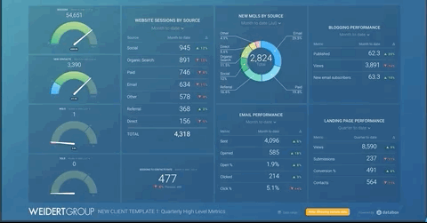
Here are a couple Databox dashboard examples:
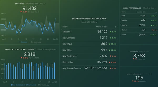
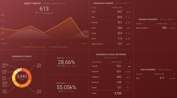
As you can see, Databox makes it easy to visualize trends and see metrics in comparison to one another all in one place, and you can use several different Databoards to get all the information you need in just a couple of clicks.
Once you create a Databoard, it can be accessed and used again and again without having to repopulate it with the most up-to-date data. It will automatically update data based on the criteria you originally set up. This streamlined approach to reporting eliminates the repeatable, time-consuming, and sometimes wasted effort of pulling manual reports each month.
While we’re focusing mostly on marketing metrics here, Databox dashboards can help you align all your departments and systems. Quickly see whether sales are closing leads, if your NPS score is falling, or if response times on support tickets are taking longer, etc. It’s all a part of keeping the flywheel going and improving overall business success.
How to Set Up Databox
Unlike some cumbersome data tools, setting up your Databox account and using it are relatively straightforward. You can start by selecting the most important KPIs for your business (website sessions, new contacts, MQLs, SQLs, etc.) to help you identify your performance goals. Then, choose the data sources you’d like Databox to pull metrics from.
Key Databox Source Integrations for Marketing
- HubSpot
- Google Analytics and Search Console
- Salesforce
- Google Ads
- Twitter, LinkedIn, and Facebook (organic and Ads)
- Wistia, Vimeo, and YouTube
- SEMrush, Moz and ahrefs
- Zapier
- Eventbrite
- SurveyMonkey
Create Custom or Templated Databoards
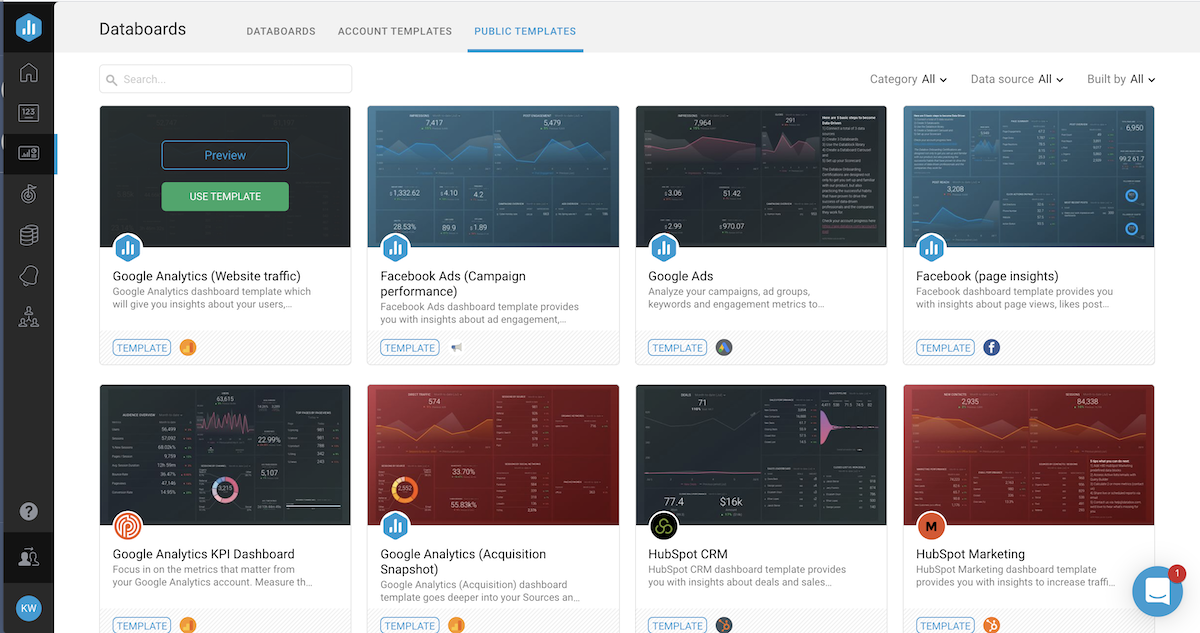
Once you’ve connected your data sources, you can build a customized marketing metrics dashboard that displays your data the way you want to view it, or you can select from hundreds of existing marketing metrics report templates in Databox’s library.
 Databox template library
How to Leverage Data from Databox Reports
Remember the days of logging into multiple accounts and importing data from each into an Excel spreadsheet, and then setting up complicated formulas to calculate the results you needed? Even if you did extract the information you were looking for, you still needed to manually transfer it into a digestible format that was suitable for sharing with key stakeholders (and hope you didn’t transpose any numbers). Another problem is that by the time you went through all those steps, the data you presented was already out of date!
Once your boards are built, the tool creates visually appealing and streamlined reports that are automatically updated in real time. This means you can easily monitor your results and make strategic decisions based on current data, allowing you to make adjustments to goals, KPIs, and tactics as needed.
The key to valuable insights is avoiding vanity metrics and focusing on truly valuable digital marketing efforts. Some examples of important metrics might include landing page conversion rates, organic traffic sources, returning visitors, bounce rates, SQLs, MQLs, and more.
All the data you need likely won’t fit on a single dashboard. We typically create multiple dashboards for our clients — a combination of high-level KPIs and additional drill-down boards to assess key inbound marketing tactics. Often, we’ll use three core Databoard displays, including a high-level website metrics overview, blogging performance, and SEO insights.
It’s tempting to get very granular, but it’s important to create Databoards that are easy to digest and tell a story about your performance. Don’t clutter it with ancillary data; if you see figures that seem “off,” you can always dig deeper to see what’s going on.
Databox Features Keep You “In the Know”: Scorecards, Alerts, and Snapshots
As quickly as marketing trends, Google algorithms, and customer behaviors seem to shift, waiting until you run a monthly KPI report may not be ideal. Databox can send scorecards and alerts right to your inbox showing your progress toward goals and alerting you about areas that may need your attention.
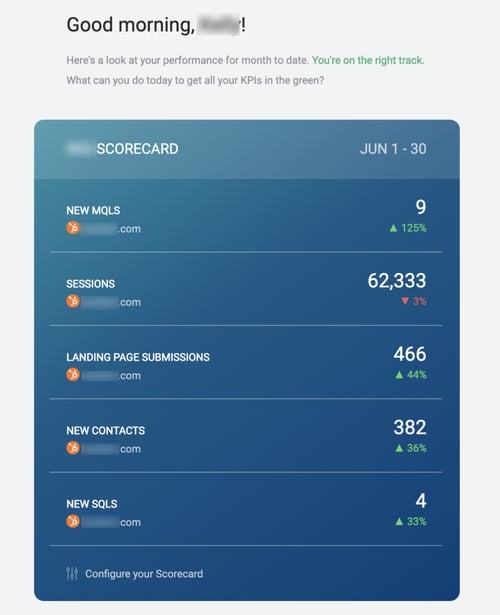 Databox scorecard email
Since Databox is accessible from practically any device (mobile, tablet, desktop, etc.), and features an app and various integrations, you can get updates through email, mobile push notifications, and/or Slack daily, weekly, or monthly. The scorecards allow you to choose up to 10 KPIs to share with your team and identify and respond to trends quicker.
Alerts can also be set up so that you’re notified when certain metrics fall outside parameters you’ve established. For example, if your website traffic suddenly exceeds a certain threshold or is trending below a set goal, you can be alerted and make adjustments. Similar to scorecards, alerts can be sent through email, push notifications, and/or Slack.
You can also schedule Snapshots to capture the status of a Databoard (or set of Databoards) at a recurring date and time and send a PDF via email to whomever you choose. For example, at the end of the month you could schedule a Snapshot send of your KPI, blogging, and website metrics boards to go to your CMO.
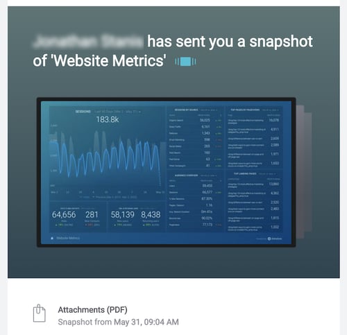
Databox scheduled snapshot
Parsing out data can be stressful and time consuming, but the ease of use and real-time capabilities available through Databox can keep marketing managers resting easy (or at least be one less thing to keep you up at night). Give it a try with a Databox free trial and test its functionality for yourself. We think you’ll find it to be an invaluable tool that improves efficiency and allows you to show tangible ROI to key stakeholders.
Having trouble identifying what metrics matter most to stakeholders? Read our step-by-step guide 7 Marketing Metrics B2B Executives Care About.


You May Also Like...

Search Engine Optimization
Zero-Click Marketing Raises the Bar for Good Marketing

Weidert Group News & Events
Experience Inbound 2026 Opens Registration for Wisconsin’s Premier Marketing & Sales Conference

Search Engine Optimization
Zero-Click Marketing: What B2B Marketers Must Rethink Now