


Background music or flash pages were thought of as cutting-edge (and pretty darn cool) when websites were still fairly new.
Attention-grabbing? Sure. Designerly? Yep. Complete time, speed, and website resources suck?
Absolutely.
Designers and developers learned a lot from the early days of B2B website design. However, there’s still no shortage of errors that make visitors cringe and tanks the user experience (UX). We’ve picked out 10 biggies to avoid as you’re contemplating what to do with a website:
Adding more bells and whistles translates to slower (and poorer) website performance. It has consequences. Lagging load times and dodgy page speed mean poor SERP rankings, fewer conversions, and potentially decimated SEO. Fast, fast, fast is the key — internet users will give a page two seconds to load. Beyond that (even one second beyond that), and it’s buh-bye opportunity.1
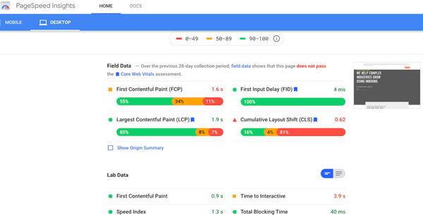
RELATED: How Google Core Vitals Will Change B2B Website Performance and Ranking
Scrolling your website holding a smartphone in one hand and a large cup of trendy coffee in the other is a way of life for many visitors. Make it happen with thumb-friendly navigation. B2B website design continues to focus on enhancements that satisfy mobile requirements. Scrolling, responsive screen sizing, and the location of the nav bar, menus, and certain buttons now largely accommodate one-thumb operation.

Color has been somewhat absent in later B2B website design. Why?
The popular term “white space,” — or the “breathing” space left around visual elements — suffered from a quite literal translation. White equals minimalism. Not true!
Bold color continues to move to the fore in differentiating brands from competitors using less saturated palettes. Color, too, has long been known as central to evoking emotional responses. The lesson here for what to do on a website: control the color, control the UX. This example from the Chobani online store does a fine job:
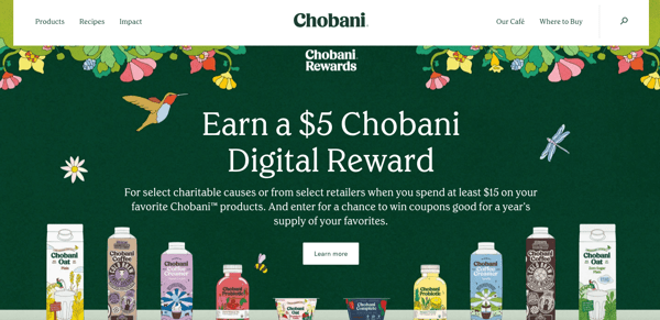 Source: Chobani
Tracking browsing histories and visitor locations is hardly a trade secret. However, leveraging geolocation tools to personalize content marketing is often underutilized.
Dynamic content allows for related, yet very different, information to appear on your site depending on visitor behavior and location. Why is a solid content management platform important? There’s the UX to consider, but repeated custom content tends to boost conversions as compared to generic offerings.1
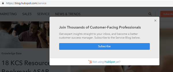
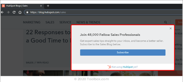 Source: Toolbox
Effective B2B website design should be informative, and it had better start with clear brand messaging. Don’t skip these imperative details for the sake of streamlining content.
Put yourself in the shoes of your sales prospects, but keep the uninitiated top of mind. They may have gotten to your site unintentionally and don’t understand what you do or why it matters to them. Tell them immediately, ideally in no uncertain terms. Potential conversions and lead generation hang in the balance, and it’s no time to exercise false modesty as you could risk alienating up to half or more of your visitors.
Say you randomly landed on this home page by clicking through SERPs. Would you know what the company does?
Source: Silicon Slopes
Advance to the lightning round if you guessed that it’s “...a nonprofit organization that exists to empower Utah’s tech community to learn, connect and serve in order to make entrepreneurship open and accessible to all.” Even that explanation is murky and would leave more than one person asking, “Yeah, but what do you DO?”
Were you ever greeted with a cumbersome “Enter Site” page that wasn’t nearly as valuable as it was pointless? It was likely enough to make you want to leave the website altogether (looking at you, Wayfair).
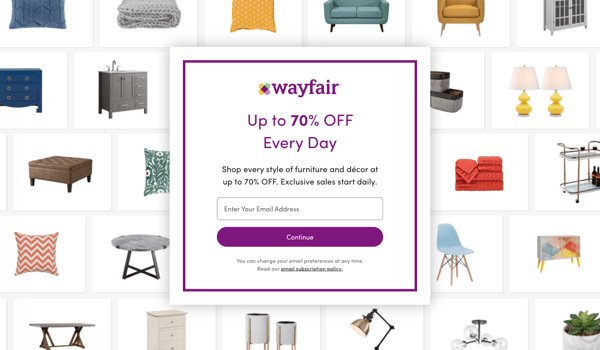 Source: Wayfair
Learn from this well-meaning but slightly misguided type of website tactic by charting a different online course.
Don’t create a barrier that requires the visitor to view an ad, click through affiliate links, or ponder a thought-for-today. People want to get into your site to learn more about your product or service, so let them! Nothing business owners can offer — perhaps short of a huge discount — can make up for the annoyance of an intentional roadblock.
Bold typography is the in-thing for B2B websites. Why? Heavy, large fonts against neutral backgrounds make headlines, and calls-to-action pop on websites or social media platforms. The combo also creates an image onto itself, which is a pretty cool solution to slow load times and page speed.
And you know something else? The text-only hero image is becoming quite en vogue as an attention-grabbing alternative to a typical hero photo image. Check out how Shy Studios in the United Kingdom rocks it:
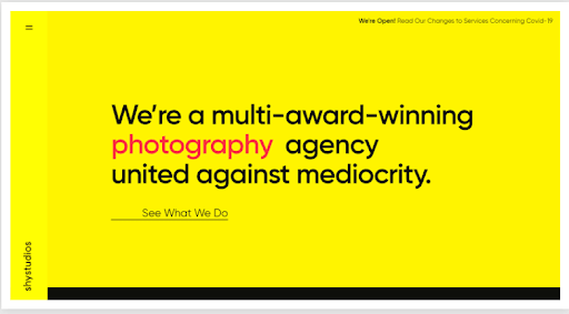 Source: Shystudios.co.uk
Minimizing or completely ignoring chatbot integration is a fool’s errand when it comes to what to do with a website. Artificial Intelligence (AI) and machine learning continue to pave the way for more human-like, customer-focused marketing interaction.
Simple service requests, information gathering, etc., are now in the most capable “hands” of the chatbot, boosting responsiveness and customer satisfaction.
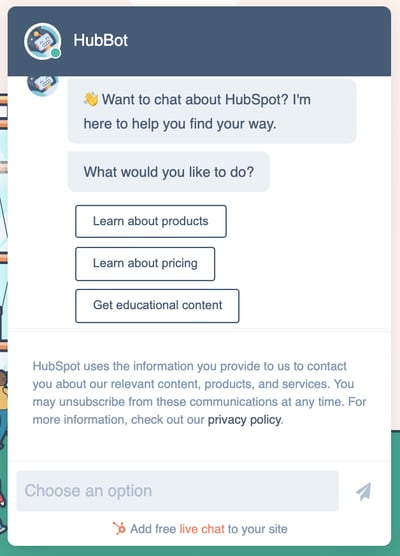 Source: HubSpot
While we’re on the topic of AI-aided conversations, let’s give a nod to voice-activated interfaces. These voice chatbots and virtual assistants (shout out to Alexa) are becoming commonly relied upon. Those looking to create a website would do well to take note of early(ish) adoption.
Using chatbots and virtual assistants is a wise choice, but temper your enthusiasm. Having AI interfacing add nauseam with visitors can be off-putting.
Micro-interactions are the tiniest movement of an icon or other website element when a cursor crosses it. The bouncing image signals to visitors, “Hey, the blog post, case studies, and other content you want are right here.” Think of it as the equivalent of the ubiquitous changing color icon.
Similarly, micro animations are exactly as the name implies. These small animations integrated into websites to provide movement, delight, personality, and guidance through certain online B2B marketing interactions.
It may seem a bit whimsical, but micro-interactions serve a purpose — namely providing direction through and around your website. Micro-interactions are a big deal, so give them more than a little thought.
Remember when hosting just about any YouTube video on your website would be enough to drive traffic (albeit poor prospects)? Yeah, not the best use of video then, and still not now.
Don’t get me wrong. Video is a mega-star in the inbound strategy and tactics lineup — as long as it is rooted in meaning. If video marketing doesn’t align with your brand, it’s not doing anything to help page loading speeds, the website design, or UX.
When considering what to do on a website, knowing what to avoid is as important as knowing what to include. Empower your B2B website design even more with the website performance enhancers contained in our Checklist: 10 Key Elements of an Inbound Website.
SOURCE
1TheeDigital, Top Web Design Trends and Standards for 2021, July 8, 2020
Topics: Website Design
